
Short Film Cinematography: Day 1 of 2
- Mike Kozlenko

- Mar 27, 2020
- 13 min read
Updated: Mar 23, 2022
A look into the good, the bad, the beautiful, & the reasonably mediocre imagery of yet another fast-paced, ambitious shoot
Hey folks, hope everyone is staying well with all the Corona-crap going on. It's definitely a tough time for us freelance filmmakers (and in general, all self-employed people) but I think there's some positives to be gleaned from all this free time. For instance, you can catch up with all your old friends that you've been ignoring for years, or the ones you don't like enough to consistently call-up during normal times 😆 (to be fair, maybe they've been ignoring you). I've been working on some portfolio things, visiting projects that I've had on the back-burner, exploring some pre-pro possibilities for a potential post-Corona project, playing guitar, learning as much about color-grading as possible, organizing my computer files, etc. It's also given me time to dive into the footage for a short film I DP'd in October called Hello Ma'am. The shoot was 2 days long.
It is still in post-production but I was able to get the footage and evaluate my work, pull some selects for a reel, and take a stab at giving it a color-grade I find appropriate. Overall, I'm pretty happy with how most of our scenes came out. Over 2 blog posts, I'm going to blabber on a bit about my approach to the shoot. People have told me that these blog posts are informative and helpful to them, which is freaking rad. These also help me personally because I don't always remember specifically how I achieved a certain look when I'm in the heat of battle, so this allows me to see what worked & what didn't. I cut together a little sizzle reel of selects, so if you want to check out some moving images from the film, here ya go: (these are color-graded, but not necessarily color-matched from shot-to-shot, just FYI)
Overview
In brief, the story is kinda about this (only including the relevant information):
A poor teenage kid goes door-to-door trying to sell chocolate bars to people, telling them it's to raise money for his dad's funeral, but it's actually just a scam. He encounters a lady at a really fancy house that actually gives him the time-of-day, but things go unexpectedly for him.
On day 1, we were shooting in a fancy mansion, and on day 2 we were filming in a shitty-looking house. Each of the locations represented entirely different themes of the story, so I tried to make the imagery communicate that. In the house, our camera mostly lived on a dolly or sticks because the environment had decorum and a sense or orderliness. This necessitated some precision & control to the camera movements & angles. I was also trying to make the lighting have a soft wash across the frame because hard light felt too "imperfect" and "damaged" and it wouldn't feel quite right in the grandness of this clean & well-organized house.
In contrast, the shitty house on day 2 needed to feel gritty and "fractured." My simple guiding principle for day 2 was a simple request that the director, Owen Schwartzbard told me: It needed to feel like "the heat of summer." To me, that phrase was everything I needed to know to tailor the light & camera movement towards the characters' frames of minds. But we'll dive into day 2 on the next blog post.
For crew, I had a 1st AC, 2nd AC, Gaffer, Key Grip, and a swing. We were shooting on an Alexa XT Plus in 3.2K on Zeiss standard speeds. I knew that it was very important to shoot on Alexa for this film because we were dealing with a lot of windows and hot highlights, coupled with a schedule that wasn't conducive for being able to finesse those brighter areas as much as I'd like, so the highlight roll-off and dynamic range of that sensor were quite a necessity in this case. I chose the standard speeds because of budget, ultimately. I wanted something vintage and superspeeds would've been the ideal choice, but the standards were cheaper and a great option in this case. I shot wide open at T2 the entire time, and I believe we went with a 1/8 black pro-mist in the mattebox. I shot at 800 ISO for most of the day.
For our lighting package, we had:
-M18
-8 Astera Titan Tubes
-Lightmat 4 & Lightmat 2
-Joker 800 (didn't use)
-300D
-1/2 Ton Grip trailer
-Fog machine (hazers are better but the fogger was free)
The Bathroom scene

We started the day off in a big bathroom that got a whole lot smaller when we brought in a menace arm, negative fill, boom operator, and a guy wearing an easyrig with a big-ass camera. This was the only handheld scene we shot in the fancy house because it was a complete change in emotion from the remainder of the scenes. Now, I have to come clean here: This scene looks mediocre in my opinion. I can't ONLY show ya'll the stuff that looks decent and not show the scenes I whiffed on. But like alot of DP's know, you have to pick & choose your battles when it comes to what you want to focus you & your crew's time & energy on. So knowing that this bathroom scene was NOT going to take up a lot of screen time, and it was OK if it felt a little more raw, especially with the aggressive handheld camera feel, I knew this was the scene to make sacrifices on. Thus, I think that this scene looks quite bad, but I kind of KNEW it was going to turn out like that. In retrospect, I would have definitely changed a few things about the setup, but let's dive into what I did do.

For setup time, we had from 8:30-9:30am to setup, and around 45 minutes to shoot. I wanted the light to have a later afternoon/early evening feel, so we put an m18 out the window with either 1/4 or 1/2 CTO and it gave me the warm color that I wanted. There was alot of natural daylight coming through the window but we didn't have time to tent it, so we didn't have TOO much light control in here. We also were getting a crazy amount of fill in here. We tossed up some negative fill but because of the fact that there was a mirror, we were severely limited in where we could put it. We menace-armed a Lightmat 4, set to around 5600k over the mirror but the size of the bathroom made it difficult to get a good angle on the light. Honestly, we might've been better off if we hung a white card in the corner of the bathroom and shot a joker into it (no money for a joleko which would've been even better, the joker was free for us to use). This might've allowed me to get a bit nicer shape on his face, especially on the wide. We could've used some blackwap clipped to the white card to control the spill. I'm not sure if that would've been better, but knowing what I know now, I definitely would considered it. In general, it was a very difficult shooting situation, so it's not much to beat myself up over.


The Living Room

The series of scenes in this area were massively important to the story. Once again we were strapped for time, getting about 45 minutes to setup for the wide shot. The problem was that there were windows on BOTH sides of the room. So on frame-left, we blacked everything out from the outside to give contrast to the room. That left us with the ambient light from the wall of windows on the right. To give a bit more ambience & punch to frame-right, we shined an M18 through an 8x8 of 1/2 grid I believe. For this wide shot, we punched the light through the middle window, but when we got into coverage, we shifted the light over one window to the right. We wafted around a tinge of fog, because everything looks better with haze, and that was all we needed for the master wide. I think it's important to note that the wall in the foreground is DARK. That's not something I did in the grade. I made sure to cut off enough ambient light from hitting that area via duvetyne. It's probably a good idea in pre-production to make sure your lighting order has enough black materials, especially solids & 4x floppies, but I've used the black side of an ultrabounce, or even the black side of griflon to block light. At times I even like to use $1 black tablecloth from the dollar store. You can use thumbtacks to attach them to walls easily. Taking away light is one of the things I do most often on set. It's good practice in my opinion. And with this shot above, I'm also not shooting directly into the blown-out windows. I'm shooting ALONG the wall of windows, so I don't get nasty clipping. This was something we accounted for in pre-production. However, if you keep reading, you'll see that we'll have to deal with this problem eventually...


When we got to the point in our shot list where we had to shoot in the direction that you see in this BTS photo up above, we had a major problem: we're shooting into 3 gigantic, blown-out windows. I would have loved to put curtains + sheers on each of those windows but art department was busy with other stuff. There was nothing I could really do. Prior to the shoot, the director & I thought through the blocking in alot of different ways; I was trying to figure out every way possible to not shoot into that blown out window because I knew we wouldn't have the time to ND gel the windows. I tried REALLY hard to think of ways around shooting into the windows, but couldn't come up with anything. The sheers would've helped out alot, but when it didn't happen, I just had no choice but to deal with it. I didn't feel comfortable exposing for the sky and then underexposing the interior so significantly and then bringing it up in post, so I exposed to the point of minimal clipping, and let the Alexa sensor take care of the rest for me. Now, what you see in the image below is a VERY manicured curve that I did in Davinci resolve, coupled with fine-tuned Davinci LOG controls; the exterior did not even look close to this on-set. Obviously I'd like the interior and exterior exposures to be more balanced, but seeing the greenery back there helps out alot, so I'd consider this a victory. For a keylight, we just tossed up the Lightmat 4 I believe and it's giving our actress really nice shape on the face. Keep in mind, I have negative fill helping keep the light looking like a single-source and not splashing light back into the fill-side.

The F**KING Front-PATIO SCENE
We filmed the living room scene for about 3 or so hours, which was really quick for what it represented in the story, but we had too much other shit to get to. We filmed a couple other scenes after our 1:30 lunch, but those were simple and kind of boring for me to write about, so I want to discuss our patio scene. We shot that from about 5:45 to 7:45. If you're a DP and you see a script that has a dialogue scene at a front door with an overhang, FREAKING RUN. lol jk. But I think these scenes are really really difficult to make look good. I can't complain though because in our case, we didn't need to shoot a master or a two-shot of this scene, which would've been near impossible. I think I got something that fits the bill and looks alright. Scheduling is important here because for the shot that is looking OUT towards the exterior, you don't want the lighting changing TOO much, but you also don't want to be battling a tremendous amount of light because then you'll either underexpose or overexpose something.

For this setup, we have an M18 booklight just off frame-right. My gaffer Keaton bounced the light into a 4x4 beadboard and diffused through a frame of 1/2 grid. And of course, a 4x4 floppy just off frame-left. The light has really nice shape to it, but does it appear TOO crafted? Maybe I'm overthinking it but if I knocked the key down a bit, and made the light a bit more side-y, perhaps it'd have a more natural feel? Since it doesn't REALLY make too much sense to have that much light coming from the front door area. That could be a nit-picky thing though; I think the shot looks fairly good as-is. The reverse was alot more challenging because we were losing light:

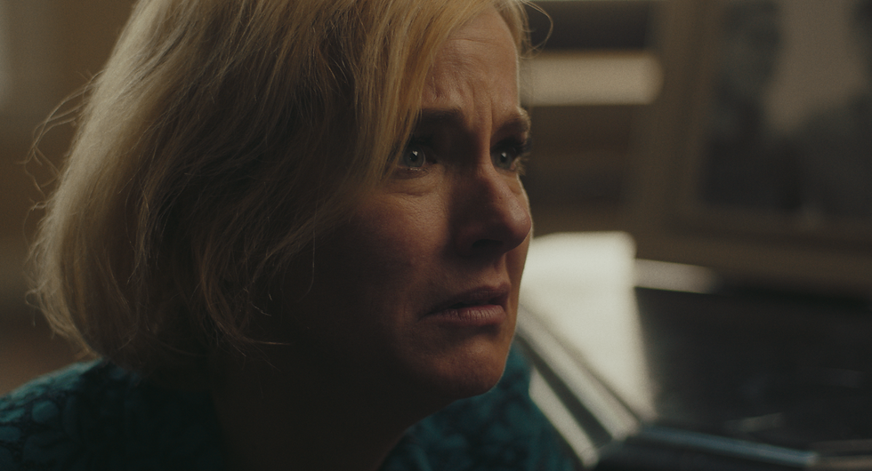
You can obviously tell that we lost a shit-ton of ambient light. You'll also notice that the living room behind our lady here is WAY darker than it is in the scenes we shot earlier, which in the edit, comes AFTER this patio scene. However, I'm not sure that it will be a MAJOR problem because the audience doesn't know that this background is the same living room. The first time we see the living room in the film is the very wide shot at the top of this post, which shows the characters walking from a dark foreground area, so it might be possible to sell this to an audience. Upon a proper color-grading & shot-matching pass, we can probably warm up the background behind her a tad bit to make it look more in the-pocket of the other stuff we shot. Lighting-wise, you'll notice that her face looks flat AF. Some contrast on the face would've been nice, but at the same time, a lot of front-door shots in movies kind of look a little flat on the face. And you can't get any negative fill there because she opens the door in the shot. We used the same M18 booklight setup, but to make the light look a little less direct and fight reflections from the glass door, we wasted the light away a little bit, as you'll see in the BTS. As it got darker, I had to boost ISO's and waste more of the key-light away to balance things out. I had to boost ISO's because swapping ND filters took too long. It was also important to warm up the color temp of the m18 because it was going really cool. I think we used 1/4 CTO. There's no formula for finding the right gel, you just kind of play that by ear and see what looks right. We added a 300D in the background bounced off the ceiling to provide a bit of level on the pillar that is on frame-left, and it also provided a little bit of a hairlight on the lady.


Staircase/Corridor Scene
Folks, I would like to congratulate you if you've read this far. You're likely part of an exclusive club of perhaps 3 or so, and luckily for you, we're nearing the end of our day 1 breakdown. Sorry for the length of this post, but there's so much to cover and the Wix blog page editor I'm using isn't conducive for efficiently organizing information on-screen. We ended our shooting day with the main character walking down a moody staircase, noticing something, then walking down a moody corridor to see what it is. For the shot below, we have 3 titan tubes rigged overhead and shooting through some diffusion that is draping down & billowing under the tubes (I wanna say it was 1/2 grid but I'm not sure). We also draped some duvetyne on the left side of the light to prevent it from spilling too much on the side walls. If we didn't have that kind of light control, our moody image would've looked really off. At the time of shooting this, I didn't own any eggcrates for my titan tubes, but now I own 4, so I would definitely be using those now. Light placement is important because I want the light to be angled down like it's a normal overhead light, but it NEEDS to be far enough down away from camera to give us nice mood in the hallway via having a dark foreground. And look at how much depth the picture frames have. Our camera tilts down and pushes in as he walks down the stairs. It was a little tricky to get a dana dolly on stairs so I had to settle for only 4' of camera movement, but it was a short shot so it worked.


With this frame, the character walks down a few steps, pauses at the mark, and then walks out of frame. We kept the overhead titan-tube light on from the previous setup, which provided nice, controlled ambient light. For our key, we tossed up some more titan tubes, matched the color to the overhead source, and added diffusion to make the light look more realistic. Simple stuff. I kind of like the half-light on his face in this shot because our character sort of has two different personas in this point of the story. Additionally, I believe we placed a titan tube in the very back to provide a tiny bit of illumination to the wall in the back of the frame because it was going too dark. If you look closely you can see it gradient-off a tiny bit on that back wall. It's incredibly subtle, but I think it makes a big difference.

Now with this silhouette shot, we kind of did it in a weird way. So look at the door on frame right. To the right of that door, there is a window. We shined a diffused m18 through it, and knocked down the level by a CRAP-TON. In my initial lighting plans, I think I wanted to have a brighter background for the silhouette than where we ended up at, but when the m18 was brighter, it didn't mix well with the white doors. It looked really cheap, so to save the image from looking like a massive pile of shit, I decided to make it way darker. Then over the door in the middle of frame, we have a lightmat 4 with a eggcrate and a partial skirt, mounted on a wallspreader to give that area of the shot a bright enough highlight to give us our silhouette. Keep in mind, toplights rarely look good unless they're very controlled. Especially in a situation like this with 2 big white doors. Now, the shot might look a little misleading because on the day, to our eye, it was NOT this dark. But I had some ND filtration in to make it look darker. The more light you have, the easier it is to control the light, and the easier it is to control ambient spill. By having the Lightmat and the m18 bright enough, when I knocked down the exposure in the camera, it made the silhouette even darker and ensured we didn't have any fill from behind camera, which would ruin the mood.

Now, one thing you'll notice is that I don't really dive too much into the creative inspirations and emotional underpinnings of the scenes that we look at. That is not to say that I didn't have all that thought out when shooting. I just don't find it to be very practical information in a blog post. To me that is more of an intrinsic thing that YOU have to look for in what you're shooting. Who knows, maybe I'll change my mind about that in the future. But ultimately you have to do the creative legwork yourself via diving into the script and discussing with the director what they're trying to accomplish. And you might see the world entirely differently from me so your impetus for framing a shot might take you down a series of thoughts that are totally different from mine; however, by showing you some of these technical breakdowns, perhaps it gets us to a similar cinematic "standard" of how we shape light & use contrast & tones to get us to what we like out of a "cinematic frame." Anyways, I hope this breakdown is somewhat helpful, and I look forward to diving into part II because we did some really interesting things on day 2. Let me know if ya'll have any questions, comments, concerns, etc.
MK
PS: These are some of the images we'll be looking at in part II in a few days:


Read "Short Film Cinematography: Day 1 of 2" a moment ago, and a few points were immediately actionable for me. Definitely bookmarking this one. check microphone
Thanks so much Kajetan, that means alot!
Here I am, a second member of the exclusive club you mentioned. (( :
Thank you so much for doing this, it's really informative and fun to read!
Those frames look gorgeous, but when you see them in motion.. Magic.
Can't wait for part II!
Hope you're doing okay. Cheers from Poland!
Thanks Markus! Part II coming shortly!
Again Mike, my favorite blog on cinematography right now. Please don't stop breaking down the good work you're doing! Excited to see the second part of this soon!